West Oakland Air Quality
Clearing the air
In 2008 a grassroots organization in West Oakland partnered with Intel Labs at UC Berkeley to start a revolution in volunteer collected data. By 2015 the groundbreaking data was no longer publicly accessible.
I was part of an ambitious project to restore access and reimagine what the citizen scientist future could hold.
My Role
User research
Ideation and prototyping
UI design, user testing
Results
Restore access to data
Alignment with community needs
Enable program to restart
Reveal the power of the idea
These are the deliverables over the course of the project.

Our goal was to restore data that demonstrates the micro dynamics of air pollution.
Background
What is the data and where is it
The UC Berkeley team provided mobile data sensors for volunteers from the West Oakland Environmental Indicators Project to collect data on walking routes through the neighborhood. The Berkeley team built a database that translates sensor files emailed by the WOEIP team into data maps.
By 2015 the Berkeley project ended and the database stopped working. WOEIP no longer had access to data visualizations.
Discover
Landscape analysis

There is a large array of air quality sites out there. I looked at other platforms and outlined some strengths and weaknesses that we might consider in relation to our project. Two platforms, EPA Village Green and EnviroScreen were closest to our mission and scope. The difference being that they were either not participatory or not mobile.
As for the other sites, the science and approach is relatable but the scale was very different.
Making air quality hyper-local

On the left is a WOAQ data path in West Oakland and on the right is data collected throughout the city at stationary sites.
The WOAQ project is at a city block level. This shift in scale points to local sources and their impacts. It revolutionizes how we look at pollution and what can be done to change it.
Workshop and analysis
We held a workshop for students and community members with our partner organization, The West Oakland Environmental Indicators Project. We looked at how better air quality would impact lives.

Personal decision making, such as:
a. Should I bus, bike, or walk today?
b. What agency do I contact to report truck pollution?
Community engagement, such as: voting, advocacy, and data driven policy.
How science looks at “citizen science”. The data may not be pristine, but the impact is real and quantifiable.
Impact of better air quality

We asked participants what success looked like for the project.
Better air quality impacts personal decisions: “Recycling rates go up”, “Amount they go outside” and “Food, what to eat”.
Air quality improvements for the community include: legislation against pollution and posts on community social media.
Success impacts science through: broadening who does science, and “National recognition”.
Our workshop participants, quoted above, strongly believed that better air would have the greatest impact on the community as a whole.
User interviews
We interviewed an experienced resident and “citizen scientist” about the user experience of collecting and uploading data.
She appreciated that she could corroborate the data with her notes about that day and location.
However, in broad terms, she said “The current process of uploading data is challenging.”
Our second interview with the co-director spoke to lasting impacts:
“Citizen Science is particularly valuable because it tracks data from unknown and unregulated sources.”
“There is no other data source for this.”
Define
Persona

I consolidated the research into a persona. This was someone to keep in mind when building the platform.
Meet Reese. She lives in West Oakland and has a strong connection to the community. Reese needs to feel proactive because she believes air pollution is causing health problems in her neighborhood.
Journey map
If Reese became aware of the soot on her windowsill, then noticed her neighbors getting sick and then thought the two things might be connected, what could she do?

This map is a storyline of how Reese feels when finding out about pollution and what to do about it.
Friction points would be smoothed through interface changes.
Empathy map
What does a typical day look like for Reese and her neighbors? What is important to her?

This attitudinal research that was reported by and reflective of workshop participants, not a cross section of the whole community.
It gave us a solid understanding of thought patterns, feelings and activities from the viewpoint of a community resident.
Ideate
Design principles

We had a visual design workshop to understand the values that shape our community partner organization and how they see themselves.
Bring the data home
In looking back at the old interface that the UC Berkeley team had been working with it was clearly geared to a research audience. We wanted to clear the noise, and bring the data home.
Here’s what we came up with.

Put in a date and see the path. Select a dot and get more info.
On high level:
Pop-up with additional information for each data point.
Simple controls.
Easy to upload.
How did it work?
Walking the neighborhood
The data collection itself was old school, WOEIP owns three mobile sensors and a GPS unit to sync location to timestamps. Residents would collect on predetermined routes.
The data from a GPS device and an air quality sensor were matched by their timestamps and the paths were visualized on maps. This was the core of what we wanted to present.
Hovering over a dot would reveal an explanatory popup based on the EPA air quality color index.

If a participant was walking near an idling truck the data would be on the map. Time and location data were connected to very local pollution sources.
Information architecture

Uploading and file selection took up the bulk of the architecture and both paths are a focus for UX development. Accounts, which is a next step after the MVP, also had a fair amount of detail.
Prototype
Wireframes

For our wireframes we worked from the information architecture and made flows for account sign in with various error states, file upload with various error states, and finally the successful upload and view of a map.
MVP

This is the landing page from our Minimum Viable Product, an important milestone. The data upload and maps were both functional, now we could debug and do some usability testing.
Design audit
We have many contributors and this has resulted in a wide array of design elements. I took an inventory of the many different versions of components and styles, here I’m showing a portion of them.

We needed to align the existing wireframe UI styles with our needs going forward. This audit enabled us to build a foundation from which to start developing a design system.
Design system

I built a design system. Our visual design workshop provided us with a palette of color to work with as well as a sense for typography that would be representative of West Oakland.
Prototype

I incorporated some changes from user testing in a new prototype.
This included clearer CTA’s on the landing page.
Information about West Oakland’s Air was consolidated below the fold on the landing page to increase engagement.
Map was formatted as a square, more aligned to the shape of West Oakland and a lot of the air sampling collection paths.
Test
Usability testing

We did user testing at WOEIP. I consolidated my notes here and annotated screenshots. We took a look at the site on a mobile device and it was not responsive. Mobile is an important part of future development.
This will be a guide for what comes next.
Next steps

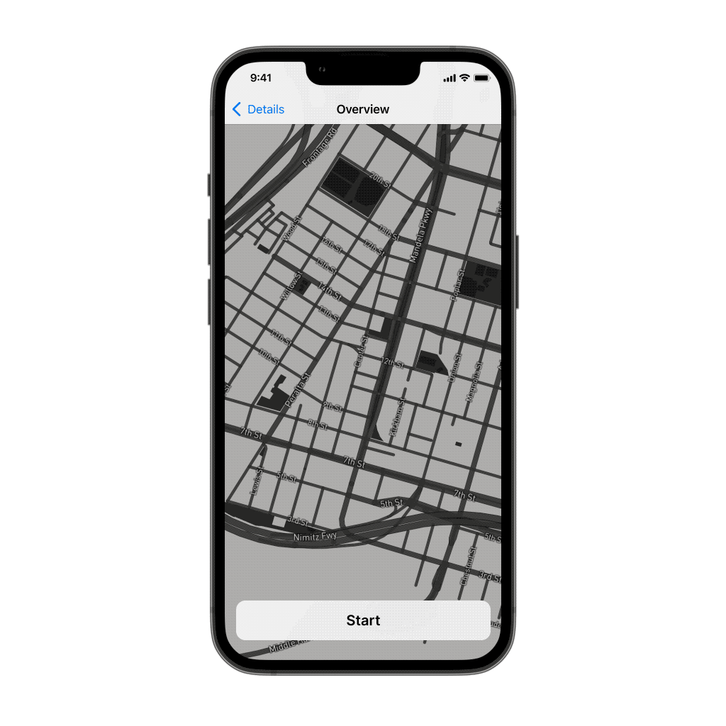
Finally I’ll come back to the prototype featured at the top. This is how it might look to incorporate this kind of testing on a mobile device.
As mobile is dominant and familiar in a way that desktop just isn’t, this was an opportunity to show an example that could be a more personal, relatable product.