Literator
Literator helps teachers assess student reading progress.
I enhanced the usability of the app through in-classroom observation and research.

My Role
User research, prototyping, UI design.
Building a design system.
Art direction and brand design.
Results
Increase accessibility of student information.
Decrease frustration in classroom setting.
Improve Literator adoption rate.
Making student progress accessible.

Literator was born out of need. The founder, a teacher, knows how hard it is to assess reading progress in the classroom. We spoke to a number of teachers who were doing in-class reading assessments. It was clear that the context was challenging.
When asked how she kept track of student reading progress one teacher responded,
“Piece of paper. Put them in groups.“
Clearly there was a better way.
Paper files were important to the task but become difficult to manage in a classroom setting. Literator keeps assessments on a mobile device. Class and student progress are always at hand.
How to prevent teachers from forgetting a student? Adopt a new mode of record keeping.

Tracking the progress of 30 or more students is a nearly impossible mental task. Adopting a new mode of record keeping on a mobile device relieves a large cognitive burden. The records you are looking for are always available.
Meeting with students who perform below average more frequently.
We went to the classroom. In our on-site research we observed the struggle to find a student in the app. This was a time consuming task. With this in mind, we looked at more in-depth filtering of student lists. Three filters would be most helpful to pull up a students information:

Alphabetical (default)
Reading Level
History (when the student was last assessed)
Asking assessment questions and taking notes.
Once the student was found in the list, an assessment could begin. Making the completed levels very clear would allow the teacher to jump right back in where they left off.

Asking assessment questions and taking notes should be very easy and all kept in the same place. In this way the teacher could register whether the student answered correctly and jot down thoughts as they were answering. If it was necessary to look back at the assessment, it would all be right there, including what the question was and the teacher’s notes about the response.
Communicating with a guardian.
From within a student entry we designed quick access to message parents or guardians. This made it easy to keep everyone on board with progress.

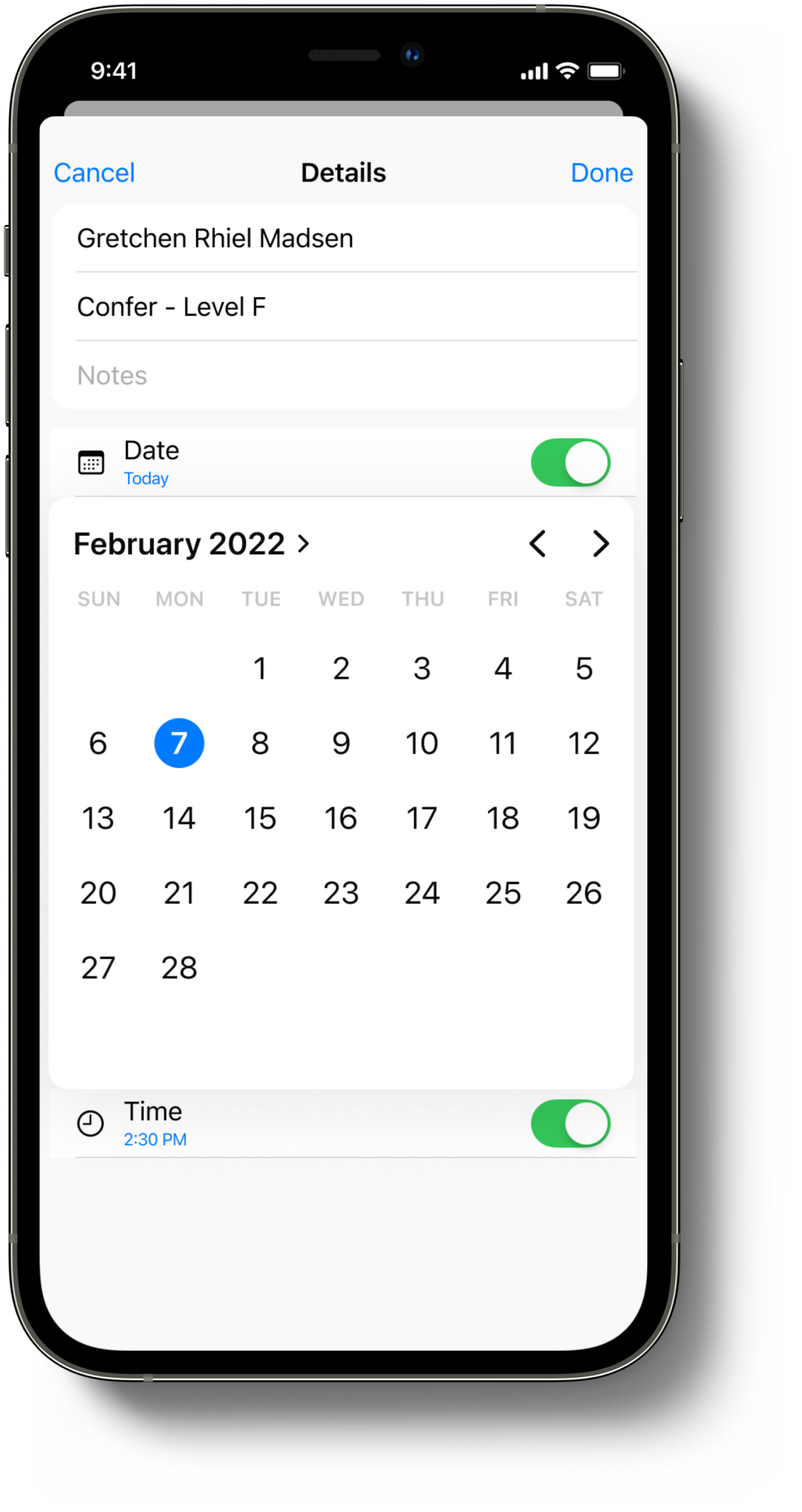
Scheduling the next confer with a student.
While the app was applauded by teachers, they found it difficult to schedule the next confer with a student. Accessing a calendar and inputting student info was time consuming and a heavy mental task in the classroom setting. Often scheduling would have to be entered at a later time.
My team and I were aware that adding more features is not always better. Yet teachers wanted this feature.
We designed a minimal date and time calendar entry modal that would be easy to access and very familiar. We deliberately kept it simple. Student name and progress is automatically entered. It was a break from the interface. Keeping the cognitive load low throughout the flow was our priority.

Storing and retrieving information on a mobile phone helps students get the attention they deserve.
We designed our process around prototyping and face to face user sessions, validating every step of the way with the input from real users. Our starting point was a straightforward list of students and a list of assessment questions. Our final product was a more fully featured app.