Candidate Guide
Simplifying the decision
Oakland wants everyone to vote. With more information available than ever before, choosing your candidate has become complicated. Voting now involves a lengthy research process and is another hurdle for voters to cross. Oakland’s Public Ethics Commission wants to make it easier to compare candidates by offering important basics about who is running and what they stand for.
I was part of an exciting project to design a guide that would help voters make an informed decision.
My Role
User research
Prototyping, UI, & design system
Visual design
Results
Improved candidate comparison
Consistent user experience
Clarity and continuity with the City of Oakland website
The state of the guide
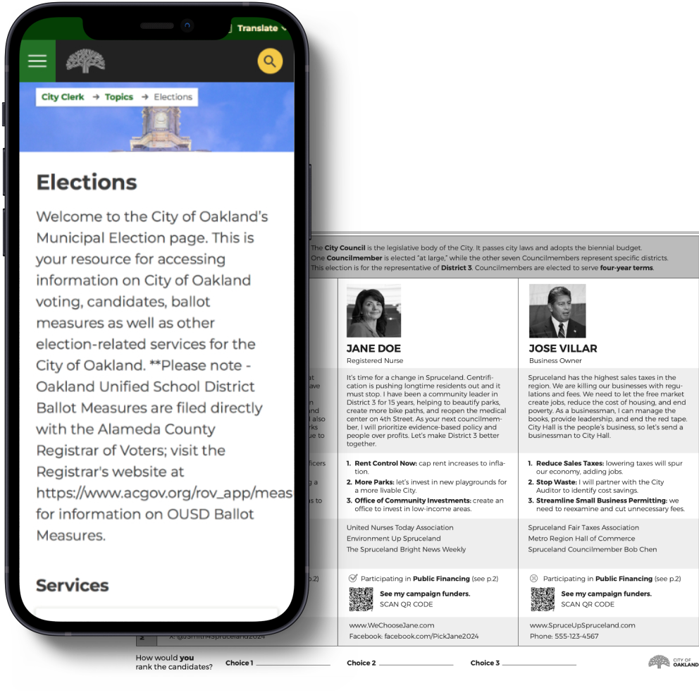
The City of Oakland website has basic election resources and services but no candidate information. In response to this, Oakland’s Public Ethics Commission came up with a spreadsheet of the candidates and information about them.
Client need
In an overview of voter guides put out by Seattle, Alameda county, and The League of Women Voters a need for a voter guide for Oakland was overwhelmingly demonstrated.
The League of Women Voters had been putting out a voter guide for Oakland elections and from 2016 through 2022 the percentage of people discovering the guide through organic search increased from 55% to 83.9% - Oakland voters want a guide and more information about elections.
The challenge
The goal was a candidate guide that makes a well-informed decision easier, ready in ten months. The concept is simple, look at the guide, compare candidate information, and decide your vote. Oakland’s Public Ethics Commission first distilled the information that voters seek when choosing a candidate. With the categories determined, the layout was next. Utilizing a spreadsheet format allowed for easy comparison. Start with the basics and evolve the guide as it gains traction while responding to a very diverse voter base. I translated the print guide to a mobile wireframe below.
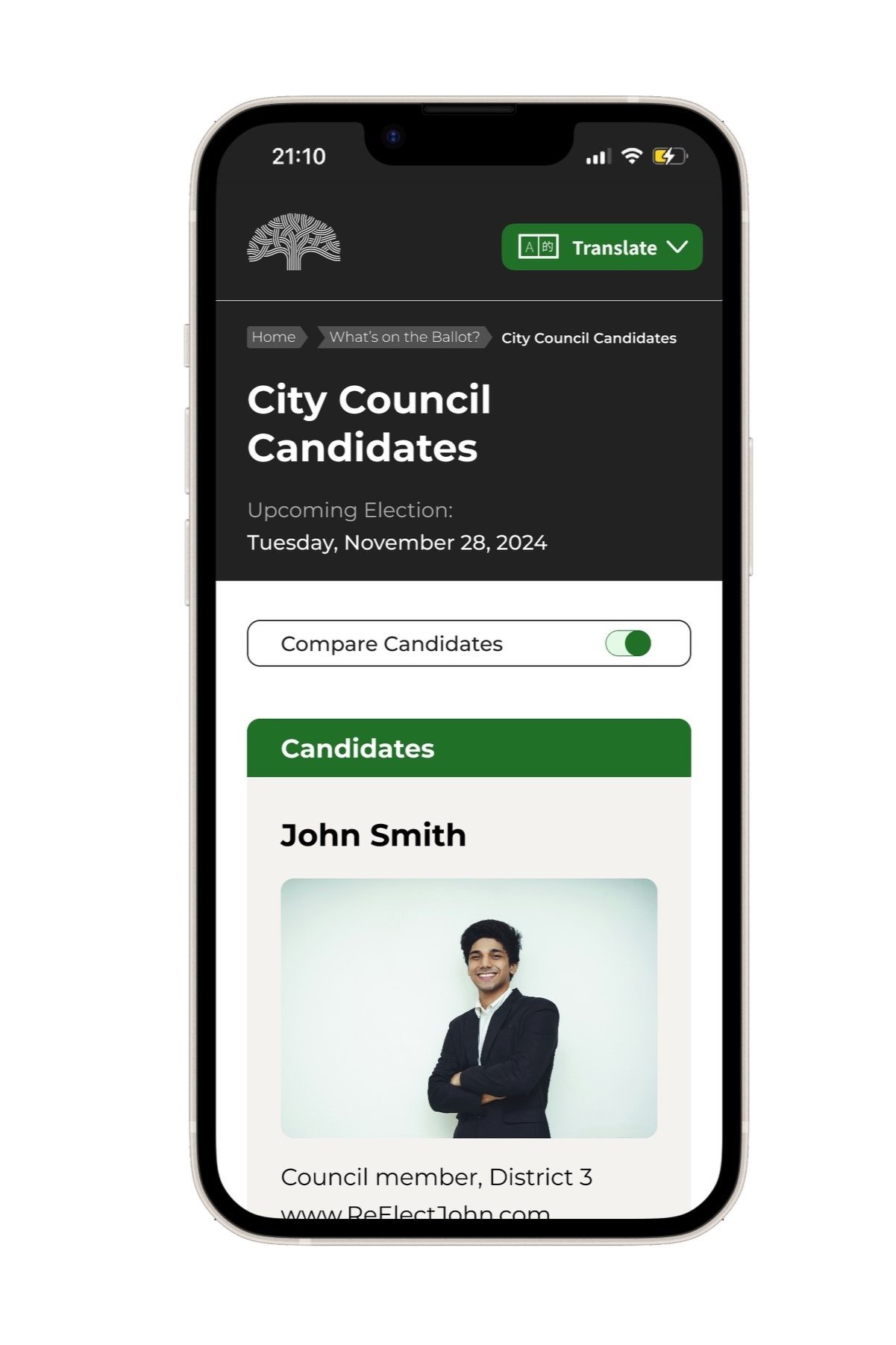
My initial design on the left gave each candidate a card. On the right, a narrower card indicates swiping would reveal another candidate. This carousel design is a great way to compare candidates side-by-side.
High level goals
Layout the information to make comparison easy.
Have a standardized format for content.
Emphasize the role of campaign funding.
My role
I led the design of the digital guide experience from November 2023 through the determination of the guide for the 2024 election.
I worked alongside another designer, 2 researchers, and a product manager with oversight from the program manager and the executive director.
Background
Where we are coming from
Required information vs voter need
There are many voter guides out there. Looking online offers a plethora of info. Some information is of questionable veracity. The local online news site even has a guide to the guides.
Perhaps the most familiar guide in our area is the booklet that the County mails out to all registered voters. In our user testing, most participants refer to this guide as an important source of information. This booklet is lengthy. It serves many purposes, and candidate information is only a small part of what it has to offer.
Information is easily buried in a guide of this nature. Voter usability is not a focus.
How can voters make an informed choice in a reasonable amount of time that is unbiased and revealing?
We wanted to provide an alternative to county produced guides, which have to serve numerous roles.
Early insights
In our research we found that 83% of voters still prefer a paper guide. We started there. Oakland’s Public Ethics Commission produced a paper Candidates Guide. It was a color spreadsheet with candidate photos and candidate submitted information.
This guide includes information on whether the candidate is participating in public financing and a link to see all funding sources.
Is the candidate guide usable
Poorly framed information will slow people down, give a bad impression, and cause errors. The time and energy spent discovering information leading to a decision translates directly into voter frustration, apathy, misinformation and possible abandonment.
I was part of a team that user tested the paper guide. We set up tables and clipboards at a branch of the Oakland Public Library and spent an afternoon engaged in qualitative user testing.
Layout
The row headers at 90° were a much maligned layout feature, and participants could not remember the content categories from row to row and column to column.
Extraneous additions
There was a map of the district on the upper right corner and a place to write your ranked choice candidates at the bottom. Both features were unclear to our test participants and were seen as “clutter”.
Unclear logic
Participants were unclear on the meaning of “Public Financing” and what the checkmark meant. The QR code destination was not clear - the url below and the text were at odds.
Improved paper guide
We addressed the issues that our research had found.
The layout became much clearer and stronger through elimination of the 90° row headings and the addition of sub headings for each candidate and each category. The map and the ranked choice voting write-in were taken away. The public financing logic was corrected and presented with unbiased language. Finally, the QR code was situated next to the url and a description.
Translating to digital
From onerous to obvious
Finding your candidates
We wanted to bring the learnings from our user testing to our website guide.
Our flow needed to accommodate finding districts appropriate to the user. We built a menu that could clearly show federal, state and local races. We were working within the flow and design guidelines of the existing City of Oakland website.
Intuitively comparing the candidates
Most important perhaps was to translate the ease of comparing two or more candidates side-by-side. It was clear that this could be replicated with a carousel. We built a second generation prototype with the ability to swipe between candidates, allowing for easy comparison. This also included navigation arrows to swipe between candidates and races.
Prototype testing
We did some testing at Oakland City Hall to get first impressions on the prototype. “This is the kind of thing we need.” was the feedback. Replacing the paper guide was no mean feat, as that was voter first choice in our research.
Knowing that most users who got to the website would be using their phones we started there.
The Impact
Ready to Roll
A more inclusive design
The carousel style wireframe fit the design parameters of a guide that allows for quick side-by-side comparison of candidates. We incorporated the standardized categories established for the paper version and optimized them for mobile.
Unfortunately, most carousels come along with usability and accessibility issues. According to Nielsen Norman Group only 1% of users interact with them at all, and 89% of them only with the first slide. There are ways to make a carousel accessible, but we were building our prototype with using the City Of Oakland’s CMS, and a carousel was not available.
We decided to work with a card based layout and offer a way to pull out the categories form a candidate’s card and group them so they could be compared.
Positive results and much more to do
The 2024 Oakland Candidate Guide is a model for approaching development with the city’s content management system. Designing to an optimal user experience and importing to a system frees discovery ideas from initial constraints. Solutions are more likely to be creatively optimized to the CMS. Concerns for accessible, responsive and equitable design ensure the interface is intuitive and accessible to all Oakland residents.
Design is never done and this guide will continue to evolve as we close in on Oakland’s Democracy Dollars program, slated to start in 2026. As a research project the guide is a voter resource that sets a precedent in comparative viewing of candidates.
Some measures of qualitative impact:
A majority of concepts from the prototype incorporated into the finished product.
High accessibility / usability score.
Exceeding the considerations of the landscape analysis.


